Data Analysis / Dashboard
Análisis de Accidentes de Tránsito
Interactive dashboard to explore road accident data in Acacías, Meta — filter, visualize trends and download a PDF report.
The problem
Road accident records in Acacías, Meta were stored as raw CSV files with inconsistent date formats, duplicate neighborhood names due to capitalization and accents, and latin-1 encoding issues. There was no way to quickly answer questions like which neighborhoods had the highest accident rates, how mortality evolved over time, or what types of accidents predominated — all critical for local road safety policy.
The solution
We built a data cleaning pipeline in Python that normalizes dates, deduplicates neighborhoods and fixes encoding, producing a clean dataset ready for analysis. On top of that, a Streamlit dashboard lets users filter by year and neighborhood to see real-time KPIs (accidents, deaths, injuries, mortality rate), trend charts, accident type breakdown, a top-15 critical neighborhoods chart, and an expandable detail table. A PDF export with key indicators is available in one click.
Screenshots
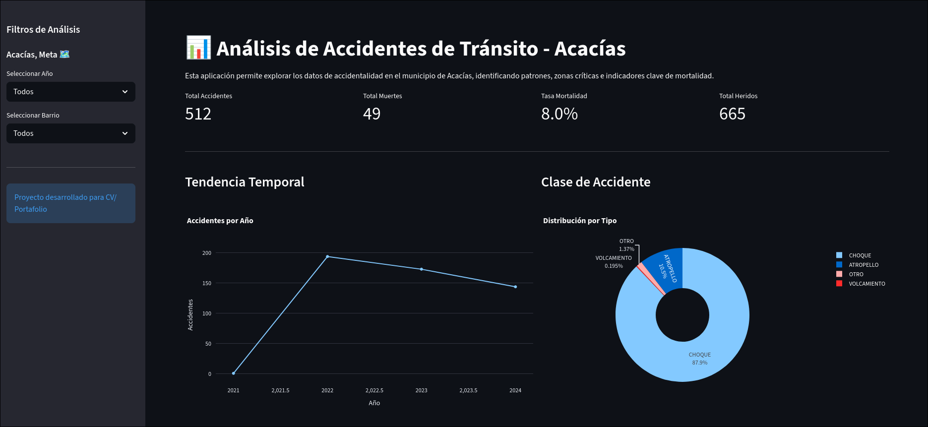
Main dashboard — KPIs, trend chart, accident type breakdown and top neighborhoods
Tech stack
Data
Visualización
App
Deploy
Results
~512 registros
Cleaned and normalized from raw municipal CSV with encoding, date and naming issues
7 vistas
KPIs, trend, accident types, top neighborhoods, detail table, filters and PDF export — all in one app
1 clic
PDF report with key indicators generated instantly from current filters